

The decision: how much a customer is worth paying for, and how fast you get it back.
Cost per acquisition is easy to hit. Cost per profitable acquisition should set the media plan, and it is almost never on the dashboard.
Questions It Answers
- Which channels and campaigns produce profitable customers, not just cheap ones?
- When does a customer from each channel break even?
- What are this month's new customers likely to be worth?
- How should next quarter's acquisition budget be split?
Break-even, Before You Get There
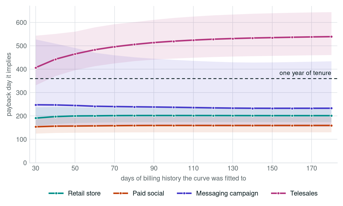
For most of a customer’s first year nothing has paid back yet, and the channel ahead now is often not the one ahead at a year. The curve says when each one crosses, and how sure that is.
Drag the slider to change how much billing the curve sees. Where two curves cross, the ranking changes.
- Solid band, its width: subscribers still active at that day of tenure. Wider means more people behind the number, not a wider margin of error.
- Pale band: a 95% interval on the fitted curve, widest where the evidence is thinnest. It is how far the curve would move on a different year of customers. It cannot cover what never reached the extract.
- Dot on the breakeven line: the day that channel covers its acquisition cost. The whisker through it is how far that date is still open to argument; one that runs off the edge is not settled by a year of tenure.
| Channel | Acquisition cost | Value at 1 year | Multiple | Breakeven day |
|---|
What You Get
Cost against return
What each channel costs per customer, against what those customers return, cohort by cohort.
The payback day
When each cohort crosses into profit, including the ones that have not yet.
Where the ranking changes
Which channels overtake which, and when.
What is settled
How much billing it takes before those dates stop moving.
What Your Data Has To Carry
Acquisition cost by source
What each channel and campaign cost. Monthly by channel is enough to start; campaign-level is better.
Billing history per customer
What each customer was charged and what settled, with dates. Daily if you have it: the curve is steepest early.
The join between them
Whatever links a customer to the campaign that acquired them. Where it is missing, we size the gap.
What Is Inside The Analysis
- Executive summary: which channels have paid back, which have not, and what the gap is worth
- Billing to date beside the projection, per channel, and why the two rankings disagree
- Six views of the same year, fitted to one month of billing through to six
- The payback date each view implies, and how open it still is
- Where the ranking changes during the year, and on which day
- Prioritised recommendations, the limits of the analysis, and the full method
The argument is how little it moves. In both samples the ranking is settled by the first month of billing, and most payback dates soon after. The date for a channel that barely clears its cost never settles, and the analysis says so.
Before You Enter Your Email
The data is synthetic, on purpose
No customer of ours appears in it. The billing is simulated subscriber by subscriber, with lapses and purges like a real database.
A range, not a date
Every projected figure carries the range the evidence allows. Where a date is not settled, the analysis says so.
Your email is not a mailing list
We send the analysis and one follow-up. No newsletter, no sharing, and "no thanks" ends it.
Get the sample value analysis
The chart above is one view of the year. The analysis holds six side by side, fitted to one to six months of billing. Pick an industry and we send it as a PDF.
On Your Own Numbers
The Revenue Diagnostic runs this on your own data, beside churn and cross-sell, on one set of numbers. On its own, or as the Acquire part of AGK (Acquire, Grow, Keep), it then stays current as new billing arrives, and adds which sign-ups are likely to start paying.
